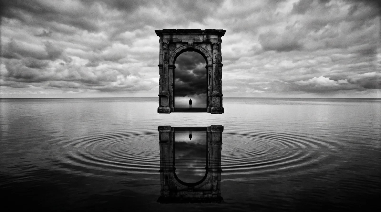
There is a paradox at the heart of The Man Who Wasn't There's visual design. The film looks like a 1940s noir, or rather, it looks like the idealized memory of one, the noir that only exists in retrospect, when every frame has been stripped of the murky compromise and budgetary expedience that characterized the real studio product. That perfection is deliberate, and it is achieved through a technical choice that would have been unavailable to the original noir directors: shooting on color negative stock, then printing entirely in black-and-white.
Roger Deakins has worked with the Coen Brothers on most of their major films since Barton Fink in 1991, and the collaboration on The Man Who Wasn't There represents one of the most concentrated expressions of what that partnership can produce. The decision to shoot color-to-monochrome was made early, and it shaped every other decision that followed: location choice, costume, production design, the specific textures of walls and floors and the fabric of Ed Crane's barber coat.
Why Color Negative for a Black-and-White Film
The obvious question is why not simply use black-and-white stock, as the original noir films did. The answer involves both technology and aesthetics.
Black-and-white negative stock, as it existed in the studio era and as it exists today, was designed to produce black-and-white images directly. The tonal mapping from the physical world to the photographic record is fixed in the emulsion's chemistry. Shooting on color negative and desaturating in printing gives the cinematographer control over how each color in the real world translates to a value of grey. A red wall and a green wall might appear identical in natural grey-scale rendering. By controlling the color filtration during the printing process, a cinematographer can push that red wall toward near-black while lifting the green wall to a pale silver, or vice versa.
For The Man Who Wasn't There, this control allowed Deakins to create the high-contrast look associated with the studio noir cycle without being bound by the technical limitations that produced it. The deep blacks in films like Double Indemnity and Out of the Past were partly a function of the sharp-grain, high-silver stocks of the era. Deakins could replicate that effect by choice rather than by accident, adjusting it scene by scene.
Light as the Primary Narrative Tool
In interviews about the production, Deakins has described his approach as attempting to find a quality of light that felt simultaneously specific and universal, tied to 1949 California in its period references, but elemental enough that it could describe something about Ed Crane's interior life rather than simply documenting his environment.
The barbershop scenes are a useful case study. Natural light comes through a street-facing window at a low angle, throwing long shadows across the floor and catching the particulate matter, hair and dust, that drifts through the air. Ed Crane stands in a world of accumulation, of small detritus and slow time. The light does not glamorize this. It catalogs it with dispassionate precision.
This is different from the classic noir use of venetian blind shadows, the striped pattern that cinematographers like John F. Seitz deployed in Double Indemnity to suggest confinement and entrapment. That image is explicitly symbolic. Deakins' barbershop light is observational. It records the texture of a specific kind of American commercial space and allows that texture to carry its own implications about the kind of life spent inside it.
Smoke, Glass, and Reflective Surfaces
One of the visual motifs that runs through The Man Who Wasn't There is the use of reflective and semi-transparent surfaces: glass partitions, shop windows, mirrors, the surface of water in a glass. These surfaces do narrative work. They produce doublings, partial images, figures that are present and absent simultaneously. But they also serve a purely optical function within the monochrome palette.
In black-and-white, reflection behaves differently than in color. Without chromatic differentiation, the eye depends entirely on tonal contrast and edge definition to distinguish a reflection from the thing reflected. Deakins exploits this in several key scenes, particularly those involving Ed's wife Doris and her lover Big Dave, where the partial visibility of characters through glass or around corners underscores the film's consistent concern with incomplete knowledge and the unreliability of what is seen.
Cigarette smoke is another persistent element. In color, smoke is a muddy grey-brown, neither beautiful nor meaningful. In high-contrast black-and-white, rendered through a color negative that can be graded to lift or drop the tonal value, it becomes a luminous, softening element. It diffuses hard light, creates intermediate zones between deep black and clear white, and gives Ed Crane a physical atmosphere to inhabit. He is almost always smoking. The smoke surrounds him like a thought he can never quite finish.
Production Design as a Function of Cinematography
Because the film was always intended to be monochrome, the production designer Rick Heinrichs and costume designer Mary Zophres made choices calibrated entirely to how colors would read in grey-scale rather than how they would look in the actual space. This is unusual. Most period films use color as a primary period-authenticity marker, the specific shades of postwar American domestic interiors, the fabric patterns, the paint chips. On The Man Who Wasn't There, those choices had to be translated.
Heinrichs has described using a technique of placing colored gels over lights on set to see how specific colors in the environment would read when the final image was desaturated. A wall that looked warm and domestic in the flesh might, under certain lighting conditions, photograph as an identical grey to the suit jacket of the person standing in front of it, collapsing figure against ground in a way that read as visually confused rather than artistically ambiguous. The production had to engineer spatial legibility in a palette that offered no chromatic cues.
The Legacy of Deakins' Approach
The Man Who Wasn't There arrived at a moment when digital intermediate processing was becoming standard, meaning the precise tonal control Deakins achieved could finally be executed with the granularity the concept demanded. Earlier attempts to shoot color-to-monochrome had been constrained by the blunt instruments of optical printing, which allowed adjustment but not the scene-by-scene, zone-by-zone control that the digital pipeline permitted.
In subsequent years, Deakins' work on the film has been cited repeatedly by cinematographers and critics as a benchmark for how to construct a black-and-white image that transcends pastiche. The achievement is not that it resembles the films of the 1940s. It does, unmistakably. But it uses that resemblance as a starting point for something more demanding: a visual language adequate to the specific kind of absence and silence that Ed Crane represents.
That is what great cinematography does, in the end. It does not decorate a story. It is the story, told at the level of light.